


The color wheel is a visual representation of all the colors found in the prism. The primary colors are evenly spaced on a color wheel, and artists of all kinds use the wheel to mix and match color shades and schemes. Read on to learn more about the color wheel and its use in design. In this video, Robie explains the basics of the color wheel and the relationship between colors.
What is Color Psychology
Have you ever wondered why the buy button on your favorite fast-food restaurant is red? Or why do doctors wear white lab coats? These are all examples of deliberate choices made by marketers based on color psychology. This beginner’s guide to color psychology in marketing will give you the basics of color theory, how to choose the best colors for your brand’s content, and which consumer associations each color has. You’ll be surprised at what you learn.
While most designers consider color’s psychological effects before creating a design, not all of them do. Incorrect color choices can lead to a poor user experience and lower conversion rates. Luckily, there are some simple ways to avoid this from happening. For one thing, it’s easy to avoid these mistakes. By learning more about color psychology, you can avoid them. But there is no such thing as perfect color. And there are still many questions to answer.
The natural-looking color brown is a good choice for a logo. It’s reminiscent of wood and stone and evokes feelings of comfort and security. Another example of a natural product or service is Whole Foods. Its logo is made of medium green, the same hue as a fresh spinach leaf or leek stalk, priming shoppers to think of Whole Foods as a healthy food option. Target taps into the primal attraction to red, with its brightly-colored logo.
For centuries, color psychology has been used to treat illnesses, increase energy, and make people feel better. The science behind it was developed by Sir Isaac Newton in the late seventeenth century. Psychiatrist Carl Jung studied the way different colors affect the human mind and even developed a therapy method wherein his patients were encouraged to express themselves through colors. Today, this knowledge of color psychology is used in advertising and marketing. But there is more to it than meets the eye.
The Psychological Effects of Color
The psychological effects of color are based on our mental and emotional reactions to colors. We react differently to certain colors depending on our culture and personal preferences. Red, for example, increases our heart rate and adrenalin in the blood. Red is also considered a ‘warm color’ and is said to evoke emotions such as passion and excitement. Cool colors, on the other hand, are considered neutral and calm. These effects are largely dependent on our own preferences, but research suggests that certain colors influence our emotional and psychological responses.
Many people believe that certain colors affect their moods, but how? Psychologists are studying the emotional and physical effects of different colors. Color psychology has largely been considered an immature discipline, though it is not. Cultural conditioning and environmental factors play a large role in color perception. It is widely accepted that color associations are directly related to certain emotions. This is why purple is often associated with luxury. But why would this be? It is important to note that not all shades of purple have the same effect on people.

Some colors have a negative impact on our emotions. The color white, for example, can make us feel aggressive when competing in sports. Similarly, white can cause headaches when it is overly bright. Another color with negative implications is black, a shade that adds depth values to all other colors. According to color psychology, black has both positive and negative associations. It can evoke feelings of inconspicuousness, potential, and emptiness. It can even influence how attractive we think we are.
Modern Research on Color Psychology
Modern research on color psychology has focused on physiological responses to color and human emotions and behavior. Scientists have used a variety of methods to measure people’s responses to various colors. Some studies use physiological responses to measure blood pressure, heart rate, and brain activity. Usually, arousing colors increase blood pressure while calming colors lower them. These findings have helped researchers better understand why colors affect us. In addition to these physiological responses, people respond to different colors differently.
Throughout the centuries, scholars have been fascinated by color theory. Goethe’s Theory of Colors attributed specific color categories to various emotional responses. Later, Goldstein built on Goethe’s intuitions by suggesting that certain colors induce specific physiological responses. His ideas focused on wavelength, and he suggested that longer wavelengths of red, blue, and green are more arousing and cool, respectively. These findings have influenced art, marketing, and design.
The effects of certain colors on human behavior and emotion date back to ancient Egypt. The ancient Egyptians observed that yellow purified the body, blue relieved pain, and purple was said to improve skin conditions. In the 1660s, Sir Isaac Newton discovered the color spectrum. His groundbreaking discovery of color psychology changed how people thought about and interpreted colors. Now, color psychology is a highly specialized field of study. And the benefits and drawbacks of each hue have been studied.
The psychological effects of color vary depending on the context. People respond to red differently, but they tend to respond more positively in situations where they feel successful. For example, a study conducted at the University of Rochester found that red was not only attractive but also negatively affected people’s test scores. So how do we use color to make our environment more appealing? It’s a powerful design tool! The answer lies in understanding the various effects of color on people.
How Color Can Influence Performance
In this article, we will discuss how different colors influence our performance. Blue enhances creativity while red improves work accuracy. Blue can also be effective in enhancing performance in analogical reasoning tests, which measure divergent thinking and memory resources. Moreover, this effect can be modulated by the type of task. Let us analyze the role of different colors in the human brain. This article is meant to provide you with useful tips on how to use colors to improve your performance.
Colors have an important impact on human behavior, from affecting memory to guiding our attention and influencing motor function. The effects of various colors on human performance vary greatly depending on the context and culture. In general, red affects performance negatively. For example, students who waited for a test in a red room showed lower test scores. For many people, red represents danger or failure. However, red has different meanings in different cultures.

According to one study, color affects human behavior and mood. Prisons in Europe have started painting their walls pink to reduce the violent behavior of inmates. Also, red sports uniforms increase creativity. Besides, designers have used color to create more appealing designs and layouts. But how can color affect performance? They have explored many possibilities. Let’s take a look at some of the findings and explore them in more detail. This article will provide you with some useful insights on the effect of color on our moods, emotions and performance.
Research on color perception and color associations has revealed gender differences in both male and female participants. In the study, male participants did not agree on which color pairs they preferred. Men and women also did not agree on whether certain color pairs were more attractive than others. If gender differences are present, this could be a sign that men prefer certain colors more than women. In short, we should continue our research on color perception and performance. After all, color has many benefits to our lives.
Color and Consumer Purchases
If you’re looking for a way to increase your brand recognition and drive sales, study the psychology of color. Color influences our behavior in many ways, and there are measurable differences between genders and age groups. For example, men are more likely to buy blue than women. And women, on the other hand, are more likely to purchase cool-colored products. Colors are not universally favored by consumers, but there are some trends that you should keep an eye out for.
One study found that proper use of color increases brand recognition by 80%. Consumers also associate certain emotions with different colors. A color’s visual impact on us can lead to a purchase in as few as 85% of cases. These findings show that colors are powerful marketing tools, and we tend to associate them with certain moods. Color psychology is an important tool for marketers to use in their branding and product development efforts. It is also important to consider the role colors play in shaping our attitudes toward products.
In today’s world, 95% of all decisions a consumer makes involve subconscious processes. The psychology of color helps brand managers create a compelling brand image that encourages consumers to make a purchase. However, while color is fundamentally important for branding, it is also important for marketers to keep in mind that the psychology of color is different for men and women. Men’s preferences are more influenced by their appearance, while women’s preference is more strongly influenced by their personality.
Color is also an important part of branding, which is why it affects buying decisions. Colors have a profound effect on a brand’s personality. They can make or break a purchase based on their personality. In addition to influencing purchasing intent, certain colors are associated with specific personality traits. So it is important to use colors that support the personality of your brand.
Basics of the color wheel
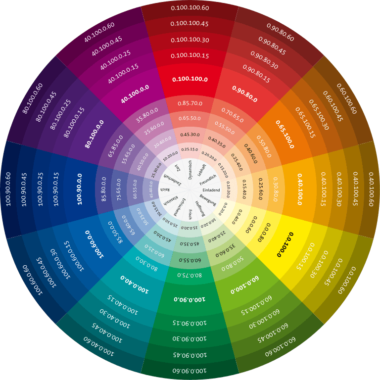
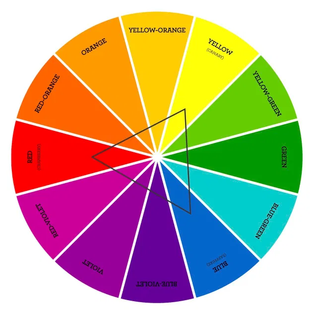
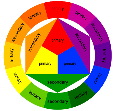
The color wheel, also known as the color circle, is a circular arrangement of colors. The primary colors sit equidistant from each other on the color wheel, while secondary and tertiary colors sit between them. In art and design, the color wheel is one of the most common representations of color theory. Other color charts include the painters’ color triangle, the printers’ color wheel, and the Goethe harmonic triangle.
Colors can be warm or cool, but this does not mean you have to choose one over the other. Warm colors reflect sunlight while cool colors reflect the sunset. Both types are desirable, though not equally effective. In addition, there are neutral colors like black, gray, and white. They are used as accents to make designs stand out and draw attention. However, there are some considerations to make before using a color wheel.
The basic rule to remember is that color mixtures work with the purest form of each primary color. These are called hues. They are different from the variants beneath the primary color. Secondary colors are created by mixing primary colors with each other, while tertiary colors are created by combining a certain color with a different hue. However, you can also use a color wheel to determine the hue and saturation of a certain color to achieve a specific effect.
The triangle color scheme is often used in the design and involves three colors placed evenly on the color wheel. When used correctly, this scheme is striking and creates a balance between dominant and secondary colors. However, it is essential to use a dominant color with an accent color to draw attention to the dominant color. In addition, a triadic color scheme contains two colors that are complementary to each other. This color scheme is the most common type of color scheme, but it works best with one dominant color and two accent colors.
Relationships between colors
The relationships between colors in a color wheel have many different effects on the viewer’s experience. They are based on saturation and contrast. A color’s temperature, or how warm or cool it is, may also be relevant in a design. Warmer colors go well with cooler colors, and some color palettes separate hues based on their overall warmth. Complementary colors are those that are at opposite ends of the color wheel but are similar enough to create a strong contrast.
Certain colors, such as red, command attention. They represent passion and love, while orange is associated with playfulness and an adventurous vibe. Green, meanwhile, evokes nature and affluence. Similarly, dark blue represents trust, femininity, and security. However, color associations can be complicated, and designers can find it challenging to choose a consistent color palette. In this article, we look at the basic principles of color theory and how it affects our perception of different colors.
The basic colors in a color wheel are red, yellow, and blue. These three hues can be mixed to create secondary colors and tertiary colors. Digital designers and artists may be more familiar with the RGB color model, which is based on Cyan, Magenta, Yellow, and Black. When using the RYB color wheel, however, it’s important to understand that the three primary colors, blue, and red, are related.
Colors are fundamental to the human experience, and color theory is an important part of creating a good design. In particular, the primary colors attract the eye and provide the greatest contrast. They can also evoke specific feelings or memories. While primary colors tend to work well in small areas, secondary colors can overshadow other colors. This is a major distinction. In designing for computer users, color can have a strong influence on the way the colors affect their eyes and mood.
Triadic color schemes
Using a triadic color scheme in design can add visual interest and drama to any project. Its history isn’t tied to the color wheel, but rather to the work of Sir Isaac Newton, who worked on light refraction and believed that prisms could separate white light into its constituent colors. Using a triadic color scheme can be easy, thanks to free templates available at Simplified Design.
One of the main reasons that triadic color schemes in design work is their symmetry. The colors are closely related, but in a triadic color scheme, each color is equidistant on the color wheel. This makes them perfect for use in interior design. While manmade creations can easily choose a palette that utilizes triadic colors, the nature-inspired palette can be a challenge.
The triadic color scheme is easy to understand and uses three colors evenly spaced around the color wheel. While a basic triadic color scheme uses red, yellow, and blue, a sophisticated triadic design uses four colors – violet, green, and orange – to create a harmonious look. Moreover, a triadic color scheme avoids the use of primary colors and emphasizes the variety of colors in an area.
If you’re unsure about a particular color and want to avoid being overwhelmed by the results, try a triadic color scheme. The beauty of triadic color schemes is that you can choose which shade of each hue will complement each other. By adjusting the shades and using complementary hues, you’ll get the perfect blend of colors for your home or business. Once you get the hang of using a triadic color scheme, you’ll be able to use them effectively and confidently.
Analogous color schemes
Analogous color schemes on the color wheel are made up of colors next to each other. You can start by selecting a standard color such as orange and then select a pair of adjacent colors – yellow and green. This color combination will give you a palette of three complementary hues. It is also possible to combine three complementary hues – for example, red and green will make a scheme of four complementary hues.
For more information, visit the color wheel. Analogous colors are the colors of the same family. They look similar to each other and are a good choice for design. There are several examples of such schemes to inspire you. You may want to choose one of these for your next project. Just be sure to provide the developer with the hex codes for the color of your choice. This will help them use the correct colors in the end.
When choosing colors for your next project, it can be a good idea to select analogous colors that are similar in hue. They tend to blend together harmoniously, never clashing, and give a pleasing image. Analogous color schemes are also great for simplicity and consistency on-screen. They can even help you create a more visually appealing color palette! But make sure you choose the right color combinations to match your style and aesthetic.
For best results, opt for analogous color schemes with at least three complementary hues. It is a good idea to keep in mind that too much of the dominant hue can throw off the balance and make a room feel stale and off-kilter. To counteract this, use other colors in your color palette to create a balanced palette. Many decorators use the 60:30:10 rule when selecting complementary colors.
Custom color schemes
In order to build custom color schemes, you should first understand the basic principles of the color wheel. In design, the color wheel can be useful because it helps us to choose which color we want for our designs. There are four ways to build a color scheme. You can use the color picker, import images, and use CSS/HTML or website color codes. With this tool, you will learn everything you need to know about colors. Learn the meaning of each color and how to use them effectively.
Creating a color scheme is not difficult if you know how to use the color wheel. The most basic type of color scheme is the monochromatic palette, which consists of different shades of one hue. This scheme is typically soothing and can be a great way to add color to your design. Alternatively, you can use analogous color schemes, which are comprised of three colors next to each other on the color wheel. Monochromatic color schemes tend to use one dominant color, with the others serving as accents and graphics.
Another method of creating custom color schemes is using the triadic method. This type of color scheme consists of colors with equal spacing around the 12 spokes of the color wheel. Though it’s difficult to pull off, it can give a design a unique look. But the tetradic color scheme is the most complex to pull off successfully, as it relies on the knowledge of chroma, value, and saturation.
Analogous and complementary color schemes are similar but with subtle differences. However, a monochromatic color scheme can also include a third color to emphasize important details. Similarly, complementary colors create energizing color schemes by pairing two or more complementary hues. These hues can be primary or secondary colors. However, it’s important to keep in mind that complementary colors are complementary. They are complementary to each other and will produce a harmonious color scheme.
To be continued. . . .


